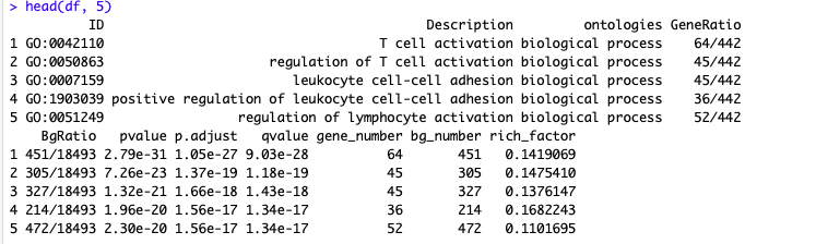
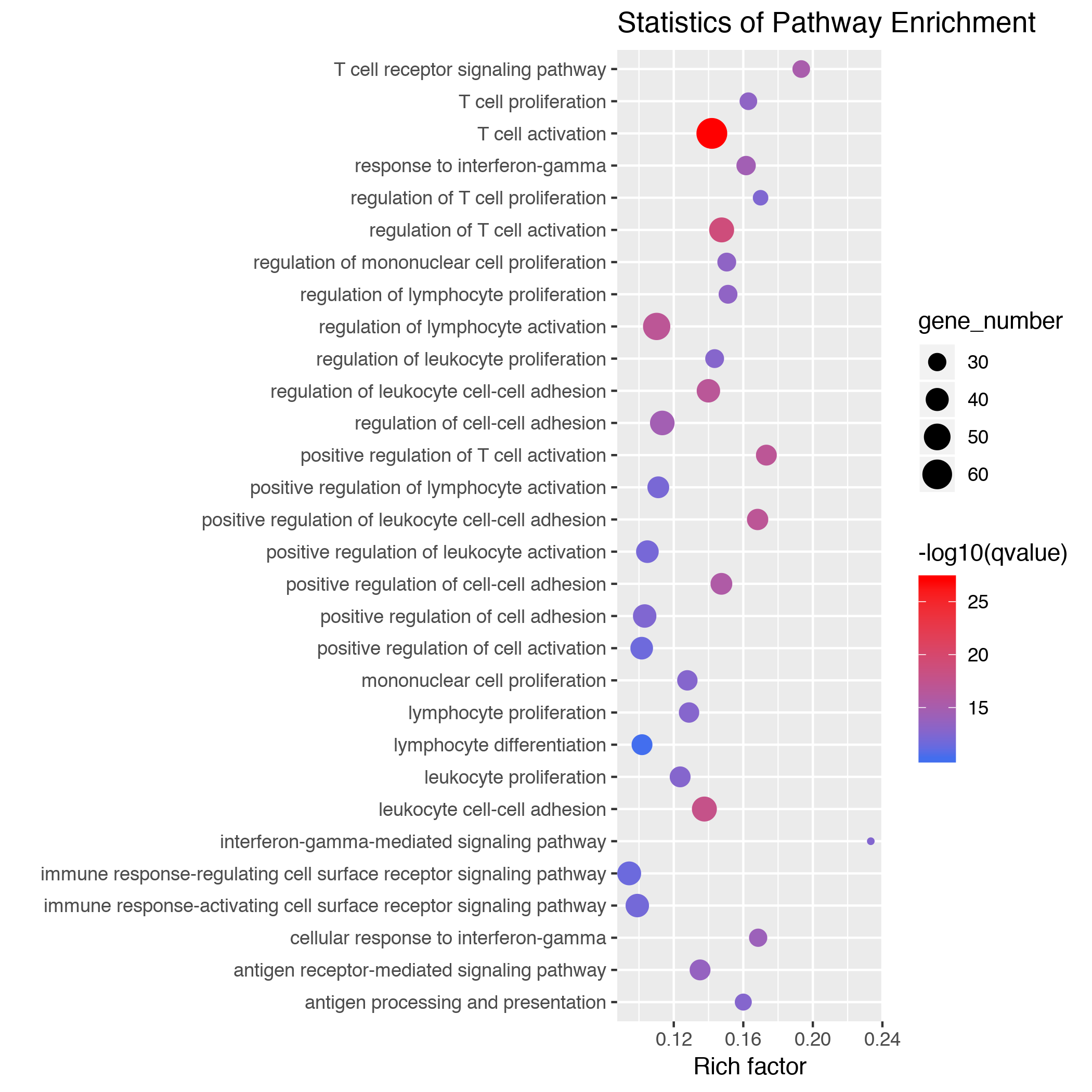
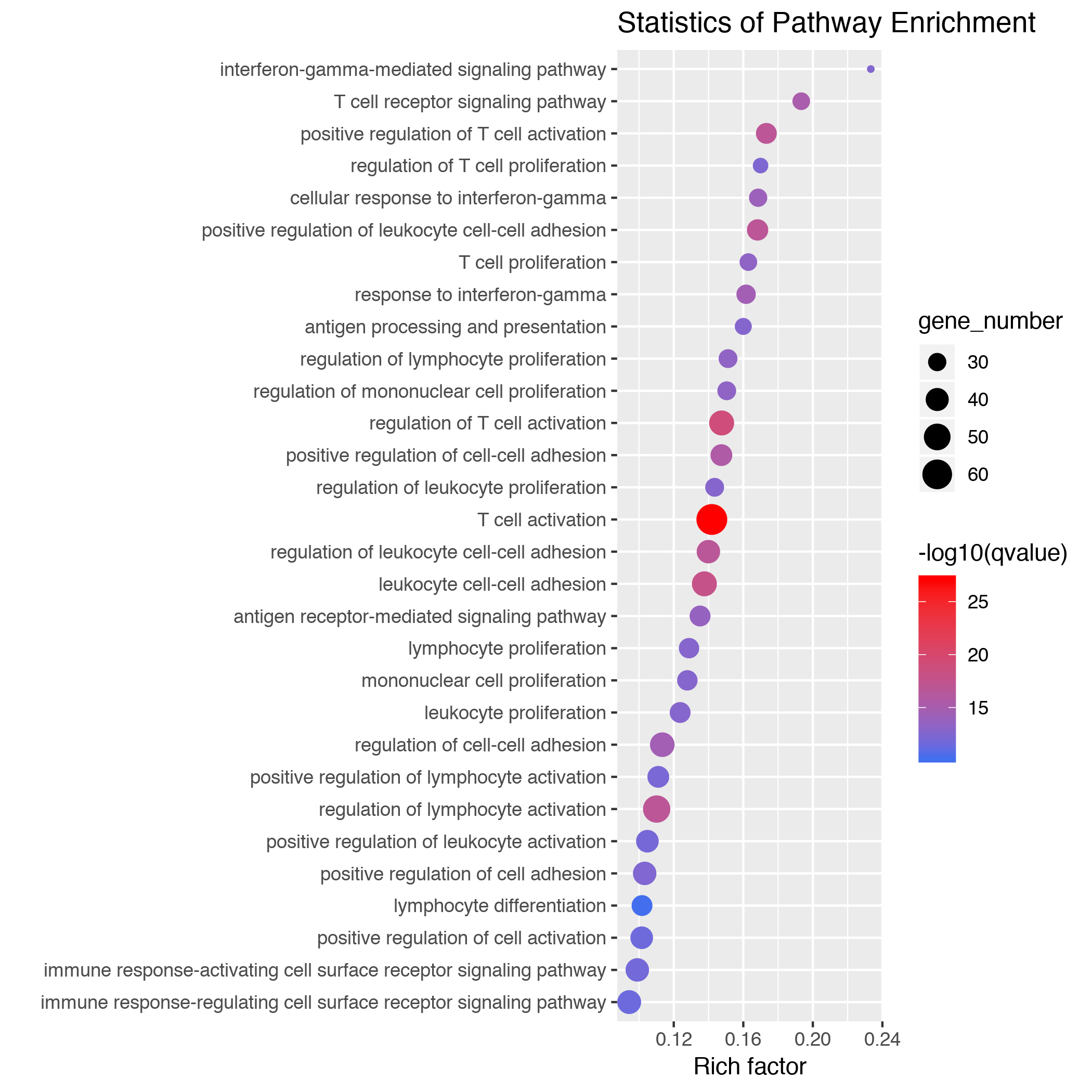
ggplot2 控制 x, y 轴排序 Posted on 2018-10-20 | Edited on 2019-04-21 | In R GO Scatter plot12345# 数据读入df <- read.table('b63c49b49d7ba1e7.xls',header=TRUE,sep="\t",fill=TRUE)# 提取富集结果前 30 项目进行绘图展示df <- head(df, 30)head(df) default order123456# 根据 label 顺序进行排序gplot(df, aes(rich_factor, Description)) + geom_point(aes(colour=-log10(qvalue), size=gene_number)) + scale_colour_gradientn(colours=c('#436EEE','#FF0000'), guide = "colourbar") + ggtitle("Statistics of Pathway Enrichment") + xlab("Rich factor") +ylab("") order labels1234567# 自定义顺序,根据 rich_factor 从大到小顺序排列df$Description <- factor(df$Description, levels=df$Description[order(df$rich_factor, decreasing=FALSE)])gplot(df, aes(rich_factor, Description)) + geom_point(aes(colour=-log10(qvalue), size=gene_number)) + scale_colour_gradientn(colours=c('#436EEE','#FF0000'), guide = "colourbar") + ggtitle("Statistics of Pathway Enrichment") + xlab("Rich factor") +ylab("") ---------本文结束,感谢您的阅读---------